OK,
I promise that my whole blog is not going to be about exercise, it just happens
to be what is top of mind in my personal life right now - and it's always fun
to marry personal interests with work!
In
this post, I explore:
- Setting and seeing goals
- Connecting a Google Form to a Google Sheet for a "live" connection on Tableau Public
- Building KPI boxes for Goals and context
- Calculating time-relevant metrics
Setting and Seeing Goals
As
a trainer for Tableau, I am surrounded by goals. Not only my personal metrics
and career goals which are well tracked and visualized at work, but of course
the goals my clients are looking to see and achieve in their data. I love me a
good 'ol reference line or bullet graph. I am sure you will see many examples
on this blog in the future. But this time around, I needed things to be even
more simple. Here are the questions and requirements I established for this
dashboard.
Dashboard
Goal: To review quick insights into workout achievements and explore recorded
workout data.
Audience:
Me!
Questions:
- In a glance, have I achieved or maintained weekly, monthly and streak goals?
- In the most recent 4 weeks, which days did I workout and what workout type was it?
- Upon exploration, what are individual workout details?
Other:
This should be designed for iPhone and interact with a Google Form for easy
tracking and visibility.
(Side Note: A few weeks ago I participated in an Art+Data workshop and am so excited to use the framework outlined in
class in my future dashboard development work!)
Here
is a live version of my dashboard, if you are reading this now...how am I doing
on my goals?
A
few notes:
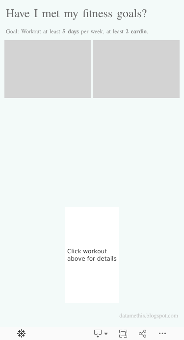
- I wanted it to be very simple. The audience is me, and I am very familiar with the data, so there isn't too much extra titles or descriptions throughout.
- The KPI boxes are a simple indication as to how I am landing with my goals.
- I loved bringing in the icons for my workouts, so I can start noticing high level patterns and preferences.
Connecting a Google Form to a Google Sheet for a "live" connection on Tableau Public
A major component of this dashboard was that the data
needed to be easy to collect and easy to update/refresh. Since I planned to
host the view on Tableau Public - the best way to do that was through a Google
Form and Google Sheet. Credit to VizWiz and Data+Science for their inspiration.
- I created a simple Google Form with the key data I wanted to collect for each workout. (Date, Type, Length and some notes)
- I built a live connection to the Google Sheet containing form responses.
- Upon publishing my dashboard, I selected "Save to Tableau Public As..." and chose to "Keep my data in sync". This prompts an auto-refresh about daily AND allows me to request a refresh if needed directly from the Tableau Public dashboard details.

- I saved bookmarks to both the Google Form and the dashboard on the home screen of my phone, for quick access after my workout. As soon as I wrap up, I quickly enter the details and refresh my dashboard!

Building KPI Boxes for Goals and Context
Since I wanted to keep things extra simple. I decided to
use colored KPI boxes to contain some of my essential goals. I've seen them
used by several Tableau Public Authors (Decisive Data and Ann Jackson to name a
few), but hadn't previously spent much time manipulating them extensively in
other dashboards. For my purpose, I needed to design some simple KPI indicators
at the top of my view, and also populate workout details on demand.
For
the KPI boxes, I placed any dynamic values on the "label" section of
the marks card. Then, used the square mark type, so I could color the
background based on my goal. (Tip: Ensure the goal=met indicator are
numerical/continuous to easily fill the background with the color using
a 2 step diverging palette) Once the dynamic fields were on "label",
I could edit the text for clarity and size.

It
was the same with the "workout details". Any field which was empty,
does not populate, but on-demand, all of the key information was presented!

Calculating Time Relevant Metrics
Design
aside, the most important information which needed to be evaluated were the
metrics - right?! This took a bit of date math and manipulation, but I
eventually got what I wanted on the view. Here are some of the challenges I
faced, and how I resolved. There is a good chance that you know of a better way
to approach these - if you have any suggestions/alternatives, please let me
know in the comments!
Challenge 1: I wanted to display 4 calendar weeks of data, and clearly indicate whether (or not) a workout had occurred.
This
doesn’t sound like a challenge, but it is with the way that Tableau presents
data. Since my original dataset ONLY contained data for days which I recorded a
workout, the calendar view I built would only show a mark for workout days.
Visually, I wanted to represent non-workout days more clearly. So, I joined my
data with another sheet which contained a list of calendar days. Now, the
workout details are "null" for days without a workout log. And I can
work with nulls ;)

Challenge 2: For the "Streak" KPI, I want to show the number of consecutive weeks the goal was met…
Ok,
if you know a better way of getting this number, please let me know! This calc
is a bit hairy, but it works.
I
started by creating a table calc which would return the "current"
streak for every week I had in my data. I used the Previous_Value() function to
lookup the streak from the previous week and add 1 to it if the current week
had met goal. This would allow me to continue adding weeks to my streaks as
long as my goals were met. The count returns to 0 if I miss a week.
There
is some added complexity because I wanted to ensure the current streak was
still displayed, even if I had not yet met my goal for the week. For example,
my goal is to workout 5 times per week. Leading up to the week of August 12, I
had met my goal 3 weeks in a row. During the week of August 12, I wanted the
"streak" to remain at 3 weeks until, upon meeting my goal during the
week, the counter would then increase to 4 weeks. (The earliest that would
happen would be Thursday…if I worked out every day that week). If I did not
meet my goal, then the streak for the following week would reset to 0.
So
this is the calc that made that happen:

Challenge
3: …but for the Streak KPI, I only
wanted to display the streak for the current week.
Now
that I had the streak for each week…I needed Tableau to ONLY show me the
current week's streak. This required some additional manipulation. If I simply
set a date-filter = current week, then my Previous_value() function would
break! It needed to reference prior weeks to determine this week's streak. SO,
I created a Table Calculation to "lookup" the week, and then filtered
on that instead. This is a nice little trick to push the filter later in
Tableau's order
of operations.

This
Boolean expression lets me determine whether the data is related to the current
week. Because it relies on a self-LOOKUP, it pushes the operation to the end of
Tableau's Order of Operations and not impact my Previous_Value() calc on this
screen.
In Conclusion…
This
dashboard has been a ton of fun to "play" with and I have found it to
be an easy and maintainable way to introduce accountability into some of my
workout goals. How would you display this data? Let me know in the comments
below!

Comments
Post a Comment