All right folks, here we go on post number ONE. I have a few thoughts, and a few fun things to share on this one.
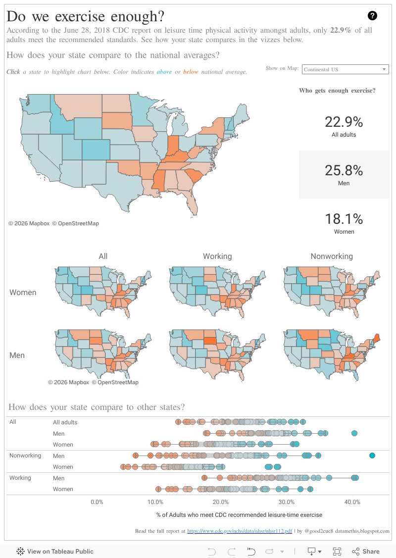
This week, I had some time to exercise my brain and dive into Tableau Desktop and Tableau Prep. I present to you, an analysis of data from the CDC on exercise habits of Americans compared to recommendations. The data is pretty disappointing and from personal experience, I certainly know why! Read below for my thoughts on choosing this data set and a few tips on how I made the viz.

This dataset was not awful, but it did need some re-shaping before it would be ready to go. Tableau Prep does not (yet?) have a PDF connector, so I did need to copy the tables from the CDC Report into Excel, but once I did that, the rest of the shaping was completed in Prep.
First, I needed to pivot the data. The original data was presented as a cross-tab. This would have made it more challenging to interact with the measures in Desktop. Adding the Pivot was a breeze, and my data was already much more accessible.

I then needed to split the percentages from the error details which were all contained in the same cell in the report from CDC. I focused on just the percentages in my analysis. I also created two new grouped fields from the Working Type and Gender field so that I could more easily slice my views by these dimensions.


A few previews and additional tweaks later, I was ready to run my flow and begin designing in Tableau Desktop.

As we know, maps are cool, but color shading is not as easy to compare as position - so enter the box and whisker plot. I used a highlight action to tie the views together, but its not as clear as I would like. I played around with some alternative ways to bring out the color, but couldn't get the views to work well together. At Tableau Conference Europe last week, the Tableau developers presented a new dashboard action they are working on. Its called a Set Action (or something like that...), and I believe it would be useful in this case to help me provide a bolder color to the states I want to focus on in the bottom view. I'm definitely going to keep my eye out for this when it comes to the Beta in the future.
That's all for now - let me know your thoughts in the comments. Happy vizzing!
This week, I had some time to exercise my brain and dive into Tableau Desktop and Tableau Prep. I present to you, an analysis of data from the CDC on exercise habits of Americans compared to recommendations. The data is pretty disappointing and from personal experience, I certainly know why! Read below for my thoughts on choosing this data set and a few tips on how I made the viz.
Why did I choose this data?
Just over a month ago, I embarked on a personal fitness journey. It was my goal to exercise at least 30 minutes every day for the 30 days leading up to my 30th birthday. This was a spur of the moment activity because I realized how little effort I had been putting into my personal health and fitness. I was only a few days from meeting my goal when I came across this report, recently published by the CDC. It spoke to me and I knew it would be a great exercise to dive into both Tableau Prep and Desktop!
What did I learn in Tableau?
Tableau Prep was a huge help.
This dataset was the first time I have really used Tableau Prep on a dataset outside of training or sample sets we've been using internally. I always loved jumping into something completely fresh, because it helps me to discover things along the way that I might not have otherwise found.
This dataset was not awful, but it did need some re-shaping before it would be ready to go. Tableau Prep does not (yet?) have a PDF connector, so I did need to copy the tables from the CDC Report into Excel, but once I did that, the rest of the shaping was completed in Prep.
First, I needed to pivot the data. The original data was presented as a cross-tab. This would have made it more challenging to interact with the measures in Desktop. Adding the Pivot was a breeze, and my data was already much more accessible.

I then needed to split the percentages from the error details which were all contained in the same cell in the report from CDC. I focused on just the percentages in my analysis. I also created two new grouped fields from the Working Type and Gender field so that I could more easily slice my views by these dimensions.
A few previews and additional tweaks later, I was ready to run my flow and begin designing in Tableau Desktop.
Distributed maps are hard to work with. (AKA - Alaska and Hawaii mess everything up)
I knew I wanted to condense the maps from the report into a small-multiples chart, to allow users to view all the snapshots together. When I built my grid, however, the zoom required to display states outside of the Continental US made it difficult to actually see the data. I decided to resolve by creating a filter from a group. This allows the user to choose how much of the mapping data they want to see.
As we know, maps are cool, but color shading is not as easy to compare as position - so enter the box and whisker plot. I used a highlight action to tie the views together, but its not as clear as I would like. I played around with some alternative ways to bring out the color, but couldn't get the views to work well together. At Tableau Conference Europe last week, the Tableau developers presented a new dashboard action they are working on. Its called a Set Action (or something like that...), and I believe it would be useful in this case to help me provide a bolder color to the states I want to focus on in the bottom view. I'm definitely going to keep my eye out for this when it comes to the Beta in the future.
That's all for now - let me know your thoughts in the comments. Happy vizzing!
Yes, 'set action' very keen to find out about that too!
ReplyDeleteEnjoyed reading this Catelyn.
And keep up the exercise, for the nation's avg sake especially ;) :D
Not sure why it says Unkown.. it's Merel
Delete